Pinterest

Saturday 31 May 2014

The Artists on the Block - Exciting News!

Hello everyone.  I think those of you who follow me regularly already know how much I love working with ATBs (Artist Trading Blocks) designed by the wonderfully talented designer, Eileen Hull, who designs for Sizzix.   Well, I have some wonderful news!

I am completely thrilled and very excited to have been invited to join Team ATB at THE ARTISTS ON THE BLOCK -  by Eileen and the fantastic designer Amy Bowerman, who leads Team ATB!  How fabulous is that!  I have had to keep it under my hat for a little while now and I cannot wait to get started...


The very talented Design Team create ATBs using Eileen's fantastic dies, which I have had the pleasure of using for a few months now.  One of my loves is creating 3D projects - the dies are so versatile and can be adapted in different ways, as the Design Team and many others have shown.  As Amy says, 'ATBs are the building blocks of creativity' and she is so right.  If you want to be totally blown away by some examples of ATBs have a look at the Pinterest page, there are some fabulous ideas there.

In honour of joining this amazing team I have made a special project, dedicated to Eileen, which in my own small way shows the versatility of the blocks.  If you have not tried using these blocks, please do, they are such fun.... and very addictive.  So, on to my first official creation for Team ATB:

From this (can you see what it might be?)


To this - a steam train.... quirky and lots of fun to make!


I used a mix of dies, obviously Eileen Hull's ATB, other Sizzix dies for the windows and doors, Tim Holtz sized circles for the wheels (along with Brushed Pewter Distress Paint) and I added a few Prima embellishments for lights, wheel nuts and bumpers - the rest is simply strong black card, with a little red thrown in.


My lovely DH is very keen on steam trains and he lent me his rail track to stand it on, he has since claimed the steam train as his own...

As I said, I wanted to show the versatility of the ATBs here but there is no need to create elaborate pieces - but it is great fun and I have lots more ideas in my head! If you pop over to The Artists on the Block HERE you will see lots of innovative ATBs that the inspirational Design Team created during this past month alone. 

Eileen also has a monthly challenge called Art With Heart where you can express your creativity (not just with ATBs either) based on a challenge theme and there are wonderful prizes on offer.  It is definitely worth a look there too, if you have the time (the May challenge has now finished).

Amy has asked me to show a few of my favourite projects from the past few months.  Click on the photos for a larger view.

One of my most favourite projects is the beach hut I created, details of which you can find here.  This showcases the versatility of Eileen's ATB die beautifully and also my love of 3D objects.  The hut now lives with my lovely friend Mo in her seaside themed guest room.


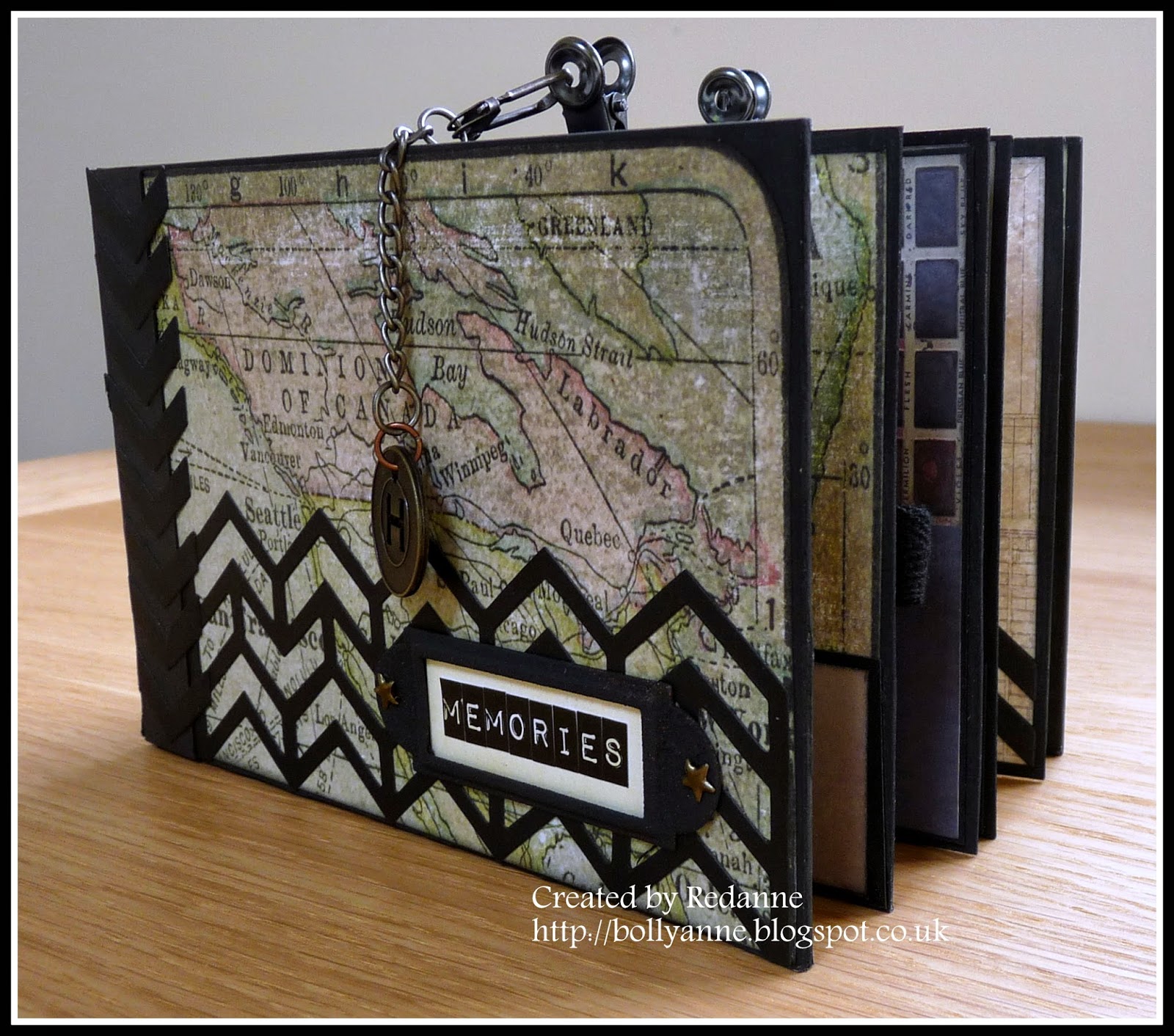
Another favourite project is my Mini Storage Box, a 3D project that showcases my love of all things Tim Holtz, I used Tim's beautiful Wallflower papers, Remnant Rubs and Idea-ology, the details are here.


My third project is a favourite from last year - an altered clock base, another of Tim Holtz's Idea-ology pieces - full details here.


Well, I think I have kept you long enough.  Thank you for looking, I hope you like my steam train and I hope you will follow my adventures with  ATBs and maybe even make some yourselves!  Take care and I hope to see you soon.  Hugs, Anne xx

Friday 30 May 2014

Get Some Texture - Challenge #7 at A Vintage Journey

Firstly I would like to say a huge thank you to my latest followers, it is lovely to have you along on my crafty journey.

My lovely and very talented friend Jenny (Buttons) has chosen the theme this fortnight at A Vintage Journey - Get Some Texture.

Unlike Jenny, who is an absolute master of texture, I do not automatically think of texture when I put a project together so there was a bit of head scratching going on here!  I created a tag......


I started off with a No. 8 Ranger Kraft tag.  I have had a pack of Tim's Kraft Glassine in my stash for ages so I took a piece of it and scrumpled it up several times to break up the fibres.  I wanted it to have a 'leather look' and tried several different stains.  The one that worked the best was Victorian Velvet which was quite a surprise, I can tell you!  I embossed it with Tim's Gear Set Texture Fade and then gave it another coat of Victorian Velvet DS. The feel of the Glassine is wonderful.

I did the same again using Ranger's Adhesive Backed Foil.  I coated the embossed foil with Black Soot Distress Paint, waited a few moments and then wiped it off.  I love the industrial look this gives.  I adhered this to the tag.  I ripped a piece of the Glassine and adhered this over the foil to create my base.  I wanted to create a warm soft feel moving across to a cool textured feel.


The number 6 has been base coated with Evergreen Bough and Gathered Twigs Distress Paint, dried and then coated with Clear Rock Candy Distress Crackle Paint which gives a lovely 'touchy feely' texture.

The metal frame has been embossed with Ranger Copper Embossing Powder, quite randomly.  Once it had cooled down I dabbed Black Soot Distress Paint and also Evergreen Bough Distress Paint.  I hope you can see some of the texture in the above photo, it is always difficult to photograph against the shine of the silver background.


I cut some Movers and Shapers cogs from some of the left over Adhesive Backed foil, I rubber over them with Black Soot Distress Paint and wiped it off with a dry cloth.

To finish off I stamped 'enjoy the journey' from Tim's Simple Sayings stamp set, added part of it to the side of the tag for some extra interest.  I mounted the whole tag onto black card.  I added some linen ribbon to the top, which I rubbed over with Tea dye DS.

I hope you will head over to A Vintage Journey to see the fabulous projects that my Creative Guide Sisters have made, you will not be disappointed.  I also hope you will feel inspired to join in this fortnight with your Tim inspired projects.

As always, our wonderful sponsors, Country View Crafts are offering a £10 voucher to spend in store, to one winner, chosen by the Creative Guides (DT).  Please do read the the rules (Travelling Instructions) to be sure that you will be considered for the prize.

Thanks so much for looking, I have another post tomorrow which has some VERY exciting news that I have had to sit on for a little while - I cannot wait to share it!!  Hugs, Anne xx


Thursday 22 May 2014

Tim Tag May 2014

It is  that time again!  Time for Tim's May Tag and I am nice and early this month.  This tag certainly challenged me, I could not get the right colours (as Tim so rightly said might happen) and it was difficult to get out all my lovely embellishments out of their packets and actually put them on one tag......  Once I did, it felt quite liberating!   

You can see Tim's tag HERE, this is my take on that tag.  


I used a No. 10 tag as my base as I could not fit everything I wanted onto a No. 8 tag.  The base was covered with Picked Raspberry, Antique Linen and Picket Fence Distress Paints and smooshed about with my fingers to give a slightly mottled appearance.  Once I dried this with my heat gun I dabbed a little Picket Fence Distress Ink over the base and used the spritz and flick technique. The edges were distress with some Black Soot DI.   I did a few backgrounds before I got one that I was happy with.


To create my tiles, I measured my elements and cut pieces of card and covered them with papers from the Wallflower paper pad and edged each piece with Black Soot Distress Ink.  All of my embellishments are from Tim's Idea-ology range, Remnant Rubs or Ephemera Packs.  I used a little Picked Raspberry Distress Stains to lightly rub over my tiles so that they 'matched' the background of my tag.


The word 'fabulous' is from Tim's latest debossing folder - Authentic set.  I dabbed black Archival ink over the folder and embossed it - I love the result!

To finish off I added some linen ribbon and a pin at the top of the tag.  I am still not sure why I found this tag difficult because now it is finished, I really like it - not something I say very often about things I create!  Hope you like it too.  See you soon.  Hugs, Anne xx


Tuesday 20 May 2014

Compendium of Curiosities III - Challenge #2

The second Compendium of Curiosities III Challenge, run by Linda Ledbetter is all about Tim Holtz's Distress Glitter Technique which can be found on Page 56 of Tim's Compendium of Curiosities III book.  You can see what the uber talented Curiosity Crew have given us for inspiration over HERE.

The Curiosity Crew will be choosing a winner and that lucky person will win a fabulous collection of Tim goodies, kindly donated by Tim and Mario!

In addition, this and every even numbered Challenge is being sponsored by the wonderful Linda Coughlin of The Funkie Junkie Boutique who is offering a fantastic $25 gift certificate.  If you have not visited Linda's shop before, she has the most amazing range of goods for sale and she delivers in super quick time.

I have to say, I am not a huge fan of glitter, I just hate how it gets into everything BUT Distress Glitter has quite different qualities, it has a distressed shine (that takes Distress inks well too) which is beautiful.

When I was deciding what to do for my project, I still my Nautical Blueprints stamps on my desk, from another project (I will show that at the end) and I just happened to have Peacock Feathers and Peeled Paint Distress Glitter on hand and so I created another underwater scene.  It is a little darker in real life but it was so, so difficult to photograph glitter!


You might be thinking that there is only one large seahorse in the stamp set - well I used a brayer to 'reverse' the image so that I could have a pair of seahorses.  It is quite an easy technique to do, I used black Archival ink and I just rolled the brayer across the stamp and then rolled it again onto some Ranger Watercolour paper.  It is a great technique to use to get more use from your stamps.  Just remember to clean your brayer straight away.  My brayer is a hard one, I am not sure if it will work the same way on a Speedball type brayer though, so do take care if you are going to try it with one of those - archival inks are designed to be permanent!


I coloured the seahorses with various shades of Distress inks to get the colour I wanted and then I coated them with Clear Rock Candy Distress crackle paint which makes the bodies look like they have fine scales.


The tag background has been created using a mix of Distress Paints and Distress inks in Salty Ocean, Picket Fence, Peacock Feathers and Broken China.  The No. 8 tag has been mounted onto black card and mounted again onto a No. 10 tag, which has been given the same treatment as the No. 8 one but has also been given a coat of Clear Rock Candy Distress crackle paint. I took it outside to see if the sun would highlight the glitter - and it did but it also lightened the colours.


For the seaweed I used some of Tim's greenery die cuts and used Tim's Glitter Technique to make them sparkle.  I used the same technique to create the sea bed.  I added the sand dollar and the star fish which have been stamped using the mini blueprints set of stamps.  These were also given a coat of Clear Rock Candy Distress crackle paint.  To finish off I added some brown cotton string 'net' (gifted to me by a lovely friend).  At the top, I coloured some vintage seam binding with Peacock Feathers Distress Stain, scrunched it up and dried it to give it a distressed feel.

The other project I mentioned is one I created for a friend, from an old kipper tin, I love to use these to create 3D projects  (I could not enter this one in the CC3C challenge because there is no Distress Glitter on it). I think she liked it....  Did I say how much I love this set of stamps!


I would like to enter the first piece into the following challenges:


Thanks for looking, hope to see you again on Friday when I will be blogging my Tim tag for this month.  Hugs, Anne xx


Monday 19 May 2014

Guest Designer at Country View Crafts

It was a thrill and a huge honour to have been chosen for a Design Team Special Mention Award at Country View Challenges for my mini box which you can see HERE.  A huge thank you to the DT!  Not only that but I am one of the Guest Designers this month - how fabulous!  Their theme this month  is Nature's Glories.  I decided I wanted to use butterflies, after all, what is more glorious in nature than a butterfly

As many of you know, I am totally in love with Eileen Hull's Artist Trading Blocks.  I had the die that cuts three blocks but I wanted the larger die too, so I purchased the large single block (3" square) die from Country View Crafts, which you can buy here, so that I could do something for this post.  Here is the finished closed block.


I cut the block and assembled it before painting the edges with Broken China Distress Paint.  I cut into some of my beautiful Maja Design papers and cut five mats for the outside of my block and six more for the inside.  The edges were covered with Broken China Distress Ink.  I took one of my Tim Holtz stencils (Doily) and randomly stencilled the mats, again with Broken China Distress Ink.  

I added some of Tim's Remnant Rubs to each of the sides.  I die cut the butterflies using Tim's Butterfly Frenzy strip die and some more Maja Design papers and applied these to the outside of the box.

I cut a whole strip of butterflies because I wanted to create a butterfly surprise inside - a kaleidoscope of butterflies! 


The butterflies are attached with thin strips of acetate so that when the box is opened the butterfly frenzy pops out!!   Each of the butterflies is edged with Broken China Distress Ink.

To finish off the top I added a large blue bead, to which I added a small pearl.

I hope you like my Artist Trading Block and of course, the gorgeous butterflies.  Thanks for looking and hope to see you soon.  Hugs, Anne xx

Friday 16 May 2014

All About Him - A Vintage Journey

I am delighted that it is my turn to host the next challenge at A Vintage Journey.  I have chosen 'All About Him' as my theme.  Men are usually difficult to make things for but with Tim Holtz's rang of stamps, dies and accessories it does make life so much easier! So with Father's Day coming up this is a great time to make something for a man.  This challenge is to make a card/tag/3D or any other type of project specifically for a man, using Tim's techniques or products wherever possible.

The other Creative Guides (DT) have made some wonderful pieces to inspire you and I hope you will pop over THERE for a look.  Do please take a few minutes to look at our Travelling Instructions  and also visit Tim's Blog for further inspiration.  Our sponsors, Country View Crafts are offering a £10 gift voucher to spend, to one winner who will be chosen by the team.

I have made a little memento for my DH who is mad about cycling and he has done his fair share both here and abroad (in his younger days).  This year we are very excited as the Tour de France (the biggest cycling event in the world) will be starting here in the UK.  It has only happened on two occasions before, in 1994 and 2007.  We will be travelling to London to see the final leg of the UK part of the Tour, in July.


I started out with two 8" square (20 cm) canvases and turned them around so that I could use the back as my base.


To cover up the staples and uneven back, I cut some thick card to fit the outer frame and insides.


Now there is a nice even base to work on.  I am not too worried if there are small gaps at this stage because it is going to be covered up.


I painted all sides of both of the frames and added two hinges to join the two together.  I did not like the hinges showing so I used some of Tim's French Industrial paper pad to cover the frames.


On the left hand side, I took one of the 6 inch pieces of paper from the French Industrial pad and placed it in the frame as my background.  I stamped the Beefeater Soldier and Big Ben from Tim's London Sights stamp set (the soldier has been stamped twice, once in black and once in red, the red part was overlaid  onto the black layer.  Both have been fussy cut and added to the background with sticky pads to raise them up.

The letters are from Tim's latest (and fabulous!) Letterpress, they have been sanded lightly and coloured with Festive Berries and Picket Fence Distress Paint.  I took Tim's Harlequin stencil and stencilled on the top and side of the frame with Vintage Photo Distress Ink. London has been stamped with Tim's Worn Text stamp set.


The right hand side of the frame also has one of the 6 inch pieces of paper from the French Industrial pad, I though it was appropriate to represent the Tour de France.  The Eiffel tower and Fleur de Lys were cut using Tim's die and then embossed using the Eiffel Tower Embossing Folder.  I touched them up with Treasure Silver to highlight the embossed areas.  Paris has been stamped with Tim's Worn Text stamp set, in Vintage Photo Distress Ink.  Finally, I added 2014 from Tim's Label Letters.


This is a view of the back, which has been covered in more of the French Industrial papers and stamped, again with the Worn Text stamp set.


Finally, I added a clasp to hold the canvases closed so that they can neatly be held on a bookshelf.

Thanks for looking, I do hope you will have fun creating something and join us at A Vintage Journey.  Please remember to read the rules.  We all look forward to seeing your Tim Holtz inspired makes!  Hugs, Anne xx

Friday 2 May 2014

Fond Memories for A Vintage Journey

The latest challenge at A Vintage Journey  has been chosen by the lovely Terry and is 'Fond Memories'.  In Terry's own words - "Fond Memories, we all have them, whether they are of a special person, a pet, a period in time or a wonderful event. Let that "Fond Memory" be your guide and the focus of your creation, of course being inspired by Tim Holtz."  

Our wonderful sponsor is Country View Crafts who are offering a £10 voucher to one winner chosen by the Creative Guides (DT).

Choosing fond memories is not an easy task when you have lots of them but I decided to create a mini album in memory of my lovely Dad and his side of our family, who remained in Aberdeen, Scotland when my Dad emigrated to Canada shortly after the war.  There is only one photo in my album at the moment, I thought it might be more interesting to see the album rather than photos of my family!  My Dad did not do 'fancy' so I have kept the album fairly masculine looking. Click on the photos for a better view.


I have used Tim Holtz's Crowded Attic papers throughout the album, which measures 6" x 4" and is approx 2.1/2" thick.  The base and pages of the album are made from grey board, painted with Black Soot Distress Paint.  I kept the front and back free from larger embellishments as it will eventually go onto my bookcase.  I also used one of Tim's new framework dies to add some interest.  I thought it fitting to have the map of Canada on the front cover, from the Crowded Attic paper pad.  The word memories is made up from Tim's Idea-ology label letters and a small frame from my stash.


The first page has a photo of my lovely Grandparents and my cousin and her hubby. I created a couple of slim pockets for the first pages and again used pieces from the frameworks die to embellish.  Dad was a Sargent in the British Army and I thought the frameworks looked a little like the Sargent stripes.

On the left hand side I created a very wide pocket  using an accordion fold which allows the pocket to expand to approx 1" thick to hold lots of photos. I created a closure with some black twill and one of Tim's Idea-ology belt buckles which I sewed into place. The right side has a single pocket to keep negatives etc.


On the left side the flap opens and there are more pockets underneath to put some journaling.  I created a little mini book with the papers that were left over and I stamped all the pages with stamps from the Mini Blueprints 6 set.


Again, on the left hand side this opens out and there are three inner pockets to house several pictures or ephemera.  The fastener is a Tim Holtz Cash Key Idea-ology piece.  The right side is plain for some notes or journaling.  The stamp is again from Mini Blueprints 6 and the Calgary post mark is an embellishment from Wendy Vecchi's embellishment range.


This is the last page of the album, the '48' signifies the year my parents went to Canada.  The 4 and 8 are Prima buttons which I stitched on and used one of Tim's heart charms and some thread to form a closure.  Behind the 48 (the year Dad and Mum emigrated) are more hidden pockets to store pictures.


This is the back of the album, again embellished simply with a framework die and Crowded Attic papers.


And finally, a photo of my lovely Dad, with his beloved fishing ground, Loon Lake in the background, near where my parents lived in Haliburton, in the northern part of Ontario in Canada.   This is one of the many photos that will go into my little album.  I have had the most wonderful (and pretty emotional) trip down memory lane creating this mini album!

So what fond memories do you have?  We all hope that you will take that trip down memory lane and come and join us at A Vintage Journey with one of your 'Fond Memories'.  Do please remember to read the rules for joining in.

Thanks for looking and hope to see you again soon!  Hugs, Anne xx


Related Posts Plugin for WordPress, Blogger...

Labels