Pinterest

Friday 30 August 2013

ICAD Swap and a Pocket Watch

Hello Fellow Blog Friends old and new!

I have been taking part in an ICAD swap which was organised by the uber talented Astrid Maclean, who you can find HERE.  If you are new to ICAD's, it simply means one card a day and each card is 3" x 5", so they are a bit bigger than an ATC, but an ideal size for putting on a card.  Astrid asked for people who would like to swap, so we are each making two (with a holder) and sending one each to two different people.  We then receive two each back. Great fun!

Today I am showing the first one I made and sent to Dianne, who is very new to blogging and I think she liked it.  If you have a minute it would be lovely if you could visit Dianne, to encourage her to keep blogging.  I think we can all remember how hard it was to get started.


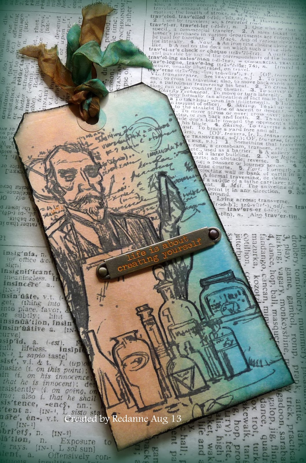
On the left is the holder, the stamp is from Inkylicious (I love it!) and I made the folder following Astrid's instructions.  The ICAD on the right is stamped using the same stamp as the holder, which I decoupaged up to add some dimension.  The papers are BoBunny and I simply added some ribbon dyed with Frayed Burlap Distress Stain, a little Eiffel Tower charm and a metal corner from my stash.


On the inside of the holder I added a lovely cameo and a Spellbinder corner die to the pocket.  The edge of the holder has been cut with a Movers and Shapers Bracket die by Tim Holtz.  All the edges have been coloured with Frayed Burlap Distress Ink.

The second ICAD and folder are winging their way to California and I will show these when they are safely received.  I can't wait to receive mine!!

I am entering my ICAD into Hels Sheridan's Sunday Stampers Week 272 - use metal challenge.

                           **************************************************

Those of you who follow my talented crafty friend Mo, who can be found HERE, will know that we attended a workshop, at MDF Man's premises, with one of my crafting idols Hels Sheridan, on Bank Holiday Monday.  We had a choice of a mini chest of drawers or a pocket watch.  We went for the pocket watch which is also a clock and is absolutely huge (18" x 14")!  I hesitate to show mine because Mo has done a much better job on hers than I have....  I kept mine quite simple and neutral so that it matches our new room.


We used MDF Man's homemade embossing paste, Stencils, Distress Ink, Acrylic Paint, Graphic 45 papers (which Rob, MDF man had kindly covered the centre piece for us with) and loads of Treasure Gold.  I can honestly say that I have never worked with such a big piece before, it did take all day but it was great fun and Hels is a wonderful teacher.


 We were given loads of butterflies and flowers to decorate it with, but I opted for one butterfly, to which I added a Tim Holtz pen nib.  I also added some Indigo Blu script stamping.

I actually remembered to take my camera and asked one of the other crafters to take a photo of Mo, Hels and me.  I am the golden oldie on the right!  We had a wonderful day.


I hope you will all pop over to Our Creative Corner on 1st September where I have the pleasure of hosting a brand new challenge.  It is my first, so I am really looking forward to it.

Take care, I look forward to seeing what you have all been up to (including a visit by some of you to see the Duke of Distress himself).  Big hugs,  Anne xx

Sunday 25 August 2013

Tim's Tag August 2013

Hello Blog Friends

It is that time again, Tim has done four tags this month which you can see HERE.  For once, I actually had two sets of the stamps he used, but for those who follow me regularly, you will know that I am totally obsessed with the Chemist set of stamps, see here and here to see how I used it, so I just had to include him. I have made two tags, as you can see here (click on the photos for a better view):


I won't go into too much detail as I basically followed Tim's tutorial and did lots of masking.  The tag on the left represents a wonderful holiday we had in Canada a few years ago, when we went on a fabulous steam train journey in British Columbia.  It is one holiday we would love to repeat over and over - nothing exotic or tropical for us!  The word band says 'Enjoy the Journey' - we certainly did.  The base is coloured with Broken China and Frayed Burlap Distress Stains.


For my chemist (have I said how much I love this stamp set?) I used Tea Dye and Broken China Distress Stains.  This set is ideal for masking, the stamps are quite large.  The word band says 'life is about creating yourself' - I have visions of a mad chemist trying to re-create another being in his laboratory..... is that better or worse than selling arsenic to a lovely steampunk lady?  I think it will be an ideal stamp set for Halloween creations.  I know he does not really fit the - where would you love to travel to theme - but Tim did say we could just use stamps that are our current favourites  - this is certainly my current favourite.


But I didn't stop there, I created two more tags because I was enjoying rediscovering masking so much.


I was not quite so happy with these, the butterfly one does not really show off the masking as well as I would like and I think the airplane one is perhaps a bit too bright, although I made sure the airplane was flying over North America to represent our visit to Canada again.  Still, the tags will not be wasted.....

I can't wait to see what Tim comes up with us for next month. I really hope he enjoys his trip to the UK this week too and that he will keep coming back again and again (please!).  Just sorry I will not be there this time but hopefully friends say hello for me and will take lots of photos and I will be watching Mario's BTS.

Thanks so much for looking!  Take care and I hope you are enjoying some crafty time.  Big hugs, Anne xx

Thursday 22 August 2013

The Chemist meets Steampunk Girl

Thanks so much to my latest followers, it is wonderful to have you along on my crafty journey!

Before I show you my project I want to say a huge  thank you to my lovely friend Jenny (Buttons).  We had a crafty day together this week, our first time meeting and we had a wonderful time.  Jenny is everything I thought she would be; charming, witty, kind, generous, chatty and so friendly - and very talented!  The time just flew by and we had fun sharing ideas and techniques.  I recommend meeting up with a crafty friend if you are able!  If you have not visited Jenny before please follow this LINK, you will not be disappointed and her Tim tag this month is stunning.

Now on to my project!  If you saw my post on the Chemist, here, then you will know how much I love the new Chemist stamp set by Tim Holtz.  I also love the Steampunk Girls set of images from the wonderful Nicecrane Designs which you can find here.  One of the girls looks like she is set in a Chemist's shop so this was a marriage made in heaven. for me!


I used a Ranger No. 12 tag which I folded in half.  This is the front cover.  I stamped the Chemist and then masked him off and used Tim's fabulous new stencils in Burlap and Splatters to create a textured background.  I added the chemical formula script stamp from the set and the words 'fragile and glass' from Tim's Remnant Rubs.  The glass vial has been filled with watered down Distress Re-inker and I added an Arsenic label.  The ribbon has been coloured with Weathered Wood DI.


The inside page has been created using the same Burlap and Splatters stencils.  The book and feather stamp is from the Chemist set again and I created a Bill of Sale from a Wendy Vecchi stamp set (Art Works) which I overstamped with the chemical formula again.  The books were stamped and then masked off to create the background, then coloured with Promarkers.


And here is the Steampunk Girl from the Nicecrane sheet.  I think she is fabulous!  She has been coloured with Promarkers and Distress Markers.  The torn notebook at the top and bottom is from a die gifted to me by Jenny (I love this die!).  The girl is looking quite demure but since she is purchasing arsenic, I am not so sure - I will leave it to imagination as to what she is going to use it for.........


Just to finish off the back page of the tag booklet I used the formula stamp again and also this fabulous Wendy Vecchi (Barcode) stencil.  There are so many fun images on this stencil, I can see this being one of my favourites.


A quick look at the finished tag booklet.  Hope you like it.  Thanks so much for looking and I truly appreciate it if you take the time to comment.  Big hugs,  Anne x

Thursday 15 August 2013

Words, Words, Words for Our Creative Corner

It is time for some mid-month inspiration over at Our Creative Corner where my very talented teamie Alison (Butterfly) has chosen 'Words, Words, Words' as our challenge theme for August.

I was totally inspired by Margie's incredible Jane Austen altered book, at the beginning of this challenge.  I had the Indigo Blu Elizabeth Bennet stamp in my stash for ages (unused) and when Craft Stamper magazine's freebie this month was a mini version, I just had to use it along with a page from the beautiful novel, Pride and Prejudice, as my 'words' element.


The base card is cream and I edged it with Vintage Photo Distress Ink and then matted some plain brown cardstock on top.  I took another piece of cream card, dry embossed it with a honeycomb embossing folder to pick up the honeycomb of the main image.  I added a page from the novel, ripped the edges and coloured with Vintage Photo DI on both pieces.

 The Elizabeth image was stamped onto cream card and coloured with Distress Ink, using a water brush.  The edges were torn and then coloured with Vintage Photo DI.  The flowers and butterfly were stamped again, coloured, cut out and decoupaged to add some interest and dimension.


added some cream lace and a lovely metal corner which has been coloured with rust Alcohol ink.


To finish off I got my Melt Pot out.  I have been a little hesitant using my Melt Pot but I had great fun doing this.  I stamped the mini freebie stamp from Craft Stamper onto cream card, coloured the image lightly and cut it with punch into a circle.  I placed a round cookie cutter over and poured melted clear ultra thick embossing powder into the circle, let it cool and then added it to the card.  How lovely to have a mini version of such a beautiful stamp.

I hope you will pop over to Our Creative Corner to see what my talented teamies have made and that you may be inspired to join in, if you have not done so already!  There is still plenty of time to join in so I hope you will come over and play along.


Saturday 10 August 2013

The Chemist

A big welcome to my latest followers, I am so pleased to have you along on my crafty journey!

Do you ever have times when you would like to create something, not for any particular challenge, but just for yourself?  These days I seem to take forever to create things for challenges - so this one is just for me and just for fun.  As a child, my lovely Dad built me a beautiful Doll's House and I spent many months decorating it and building furniture for it and creating little scenes.  When I saw Tim's new stamps of 'The Chemist' I immediately wanted them so that I could make a Chemist's shop or some kind of display.  Easier said than done!  I tried using a configuration box but the images, although quite large, just did not work.  I don't have one of the new slimmer configuration boxes with a lid, which would have been perfect, but undaunted I used a box that I already had in my stash.  After all, this was meant to be just for fun.........


The box is 6.1/2" square and just over 1" deep, it is very sturdy and you can see in the photo that I have started marking out a window.


And this is what the shop front ended up looking like.  The finished item has an acetate window but I left it off so that I could photograph it better.


The Chemist's pots and jars are coloured with Distress Inks and they have been set on a small table created from card.  The Chemist and pot stamps come separately so that you can place them in different situations.  I love that about this set of stamps.  The wall in the background has been created with backing paper and the 'chemical formula' on the wall has been stamped with black Archival Ink.

The lamp shade was created from card and the bulb is a Tim Holtz Ideaology bulb.


The window frame has been painted with PaperArtsy Fresco Finish in Vintage Lace as the base.  This was coated with Crackle Glaze and then over-painted with Fresco Finish Chocolate Pudding.


The bottles are Ideaology - they have been tinted with alcohol inks, one in Rust, one in Denim Blue and then the jars were filled with coloured sand.

The labels are by 7Gypsies.  What self respecting Chemist in those days would have been without a bottle of Arsenic....

The sign base above the window has been created with a Tim Holtz On the Edge die - Plaque and Postage.


The colours on the chemist sign are the same as the window but I applied a thicker coat of Crackle Glaze and used a thinner top coat to give a more weathered look.  Alpha Parts have been used for the word.

I am so pleased with this set of stamps, the images are large - well done to Brett Wedele for designing them and to Tim for using those designs.

Thanks for looking!  Take care and have fun creating.  Big hugs, Anne x


Sunday 4 August 2013

Vintage Flower Postcards

Hello Everyone

Thank you for all your lovely comments on my Domino Accordian Book, every one was appreciated so very much.

For my Design Team post this month I am highlighting one of the fabulous Vintage Flower Postcards from Nicecrane Designs and you can find the sheet I used HERE.    If you love vintage flower images you will love this beautiful sheet.

I wanted to do something a little different.  My craft group friends visited this week and Lynn had purchased a new book on using embroidery frames to make altered art pieces (Hoop-la! by Kirsty Neale).  I have had an embroidery hoop in my stash for a while and I was so inspired by the book I just had to have a go and this is what I created.  Click on the photo for a better view.


The hoop is made from plastic and comes in two parts with a hanger at the top.  This is how it looked at the start.  I have taken it apart to give you a better idea of the base.  Edited - the size is 6" x 4.1/2".


I painted the outer ring (above left) with Paper Artsy Fresco Finish paint in Vintage Lace.  The inside ring (above right) was painted with Fresco Finish Mocha Mousse paint.  Both paints are opaque and gave a really good cover.  One coat was sufficient to cover the frames.  The texture on the frame still shows through beautifully.


In this photo you can see the beautiful image close up.  It is bouquet made up of Anemones and Mimosa - just gorgeous.  I printed it off on glossy card, cut it to size and glued it to the inner frame.  I have not taken a photo of it but I added a sheet of French script paper to the back of the frame.


To finish off I used the Tim Holtz mini tattered floral die (a birthday gift from my lovely friend Mo), which I coloured with Spun Sugar and Peeled Paint Distress Paints and added a small brad to the centre.


Another photo showing the bow and  ribbon I added to make a hanger.

 I hope this has inspired you to have a go at altering something!  Thanks so much for looking and please do check out the gorgeous designs over at Nicecrane, you will not be disappointed.  Big hugs, Anne xx
Related Posts Plugin for WordPress, Blogger...

Labels